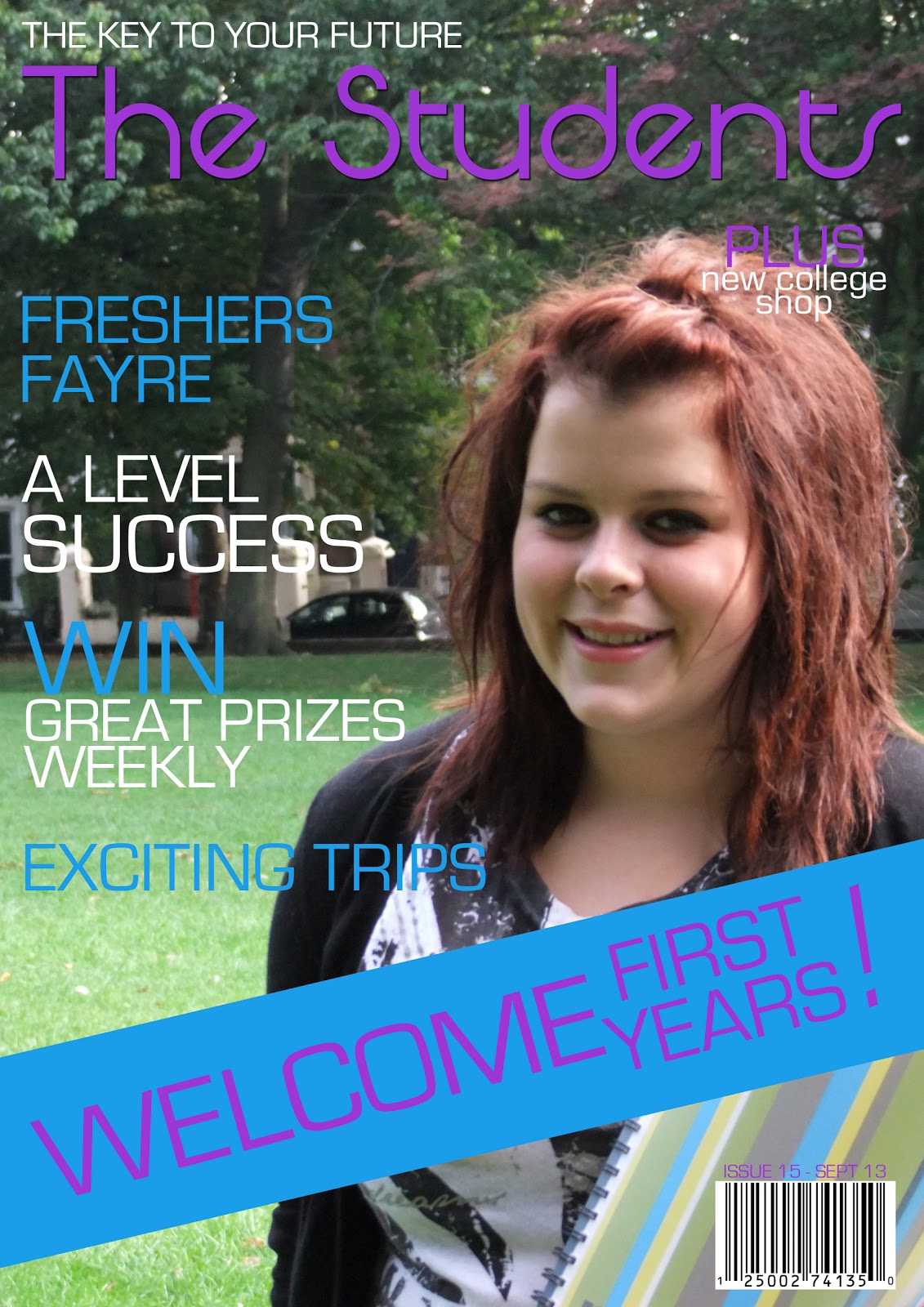
Compared to Vogue magazine, my student magazine follows many of the same conventions set by professional magazines. The mast head is in a large, dominating font at the top of the page so it stands out at a glance when the magazine is being sold in a shop. Above the mast head is a sky line, however this is not used in Vogue magazine. The sky line uses the slogan of QE to remind the students what being a student here is all about - achieving the best for your future. On both magazines there are sell lines surrounding the picture, these give an insight to what articles the magazine contains. the font is a range of sizes and various colours, this draws the readers attention into the most important words, for example: on my front cover the word 'success' is in larger capital letters than the rest of the sell line. This is a word that attracts every student as everybody whats to succeed in college to ensure they have the future they would like ahead of them. On the front cover of Vogue the word 'exclusive' stands out from the page as it is in large, red capital letters compared to the lowercase white font used for the rest of the page. This word tells us that this is the only magazine to include this article so it is a must-have!
My photography is similar to the image used on the Vogue cover, they are both medium close up shots but they are in different settings. The photograph for Vogue has been taken in a studio which gives a professional touch and the photo i have taken was set in the park outside of college. Unlike Vogue magazine, I used a notebook as a prop for my photograph. Using the park as a backdrop and the notebook for the props it suggests that although college takes up a lot of time and effort with the coursework, there is also time for you to have fun with new friends and enjoy your social life. I only used natural sunlight for my photograph as this gave a perfect effect on the model's skin tone, this meant there was no need for artificial studio lights. The model on my front cover wears comfortable and casual clothing which she would wear to college and her pose is friendly and relaxed, however on the front cover of Vogue the model is wearing a formal evening dress and has a sultry expression on her face.
My media product represents students who attend QE. They have been represents not only by the photograph on the front cover but also by the color scheme. Purple is the colour of QE's logo so the magazine fits in well with the college. The model on my front cover is a stereotypical teenage girl. She has style and follows the latest fashion and make up trends. I would place myself within this group of people which is why i have reflected this onto my front cover. My front cover reinforces that students are still able to enjoy their social life while working hard at college.
Knowing who the specific audience for my magazine is makes it easier to design a product for them. I see myself within this particular audience so it makes it more obvious as to what the readers like and dislike. I was influenced by my intended audience to make it look as stylish as possible - nobody wants to be seen reading a magazine with a boring front cover! The costume of the models fits in with the latest styles in fashion magazines and this is seen as attractive to the target audience. The girls in my audience have a narcissistic relationship with the model: they want to be like her, and the boys who read the magazine have a fetishistic relationship between themselves and the model. The language used on the cover for the sell lines is slightly casual to make the audience feel at ease and relaxed. The content of the magazine reflects the topic of a student college magazine, all the articles included are about finding extra things to do at QE and how to get involved. A notebook was used a prop, every student needs a notebook for every lesson so it is easily recognised as a student magazine.
I produced a survey for my friends and people who would fit the target market of my magazine, I asked them:
- would you read this magazine?
- what do you like about it?
- what don't you like about it?
- what attracts you the most when you first look at the front cover?
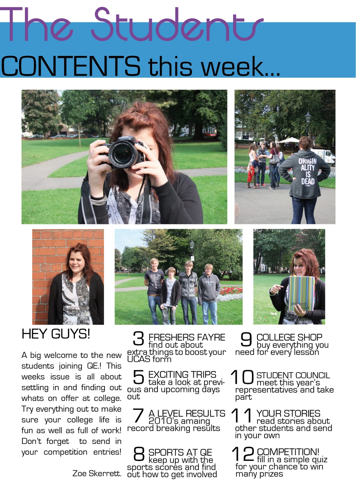
I presented 10 people who are aged 16-17with these questions, they all attend QE college and have an interest in balancing college work with their social life. 9 of these people said they would read my student magazine, 1 person said it would have much of an interest to them as he would prefer to read about more sport or music rather than extra things to do at college. All of the people i questioned agreed that the front cover has just the right amount of text on it and that the colour scheme fits nicely with the college colours. the language was noticed as quite casual rather than formal, and this was seen as more appealing to the age range. Most people commented on the girl as my model, and said the park in the background looks more interesting that if i had used a corridor for my backdrop, however, one person suggested using a group photo for the cover would make it look more interesting and fun. People agreed that the use of different font sizes, varied font colours and capital letters was a good way of making certain words stand out, however many said that this scheme should be carried onto the contents page to make the article titles stand out from the summary underneath. The welcoming banner attracted most of the people i questioned as it makes them feel like a part of the college and gives a sense of belonging.
To construct this magazine i used many different soft wares and new technology that i haven't used before. In the classroom we use Apple Macs as these are brilliant computers that are excellent for design work. The first thing we did was create a Blogger account. I used this to present my work, this is an interesting and modern way of showing the work i have done and how it has been developed from the beginning. I feel my product has benefited from being displayed online as it is easy to access by anybody and looks more tidy and professional that if it was written on paper. I scanned in my flat plans using a Canon scanner and then posted the two pictures onto my blog. Having the pictures online made it easier to refer to when i was working on the construction of my preliminary front cover and contents page. I used Photoshop to design my front cover, i haven't used this program before but it soon became easy to work with and the separate layers made it easier to organize the positioning of everything. I used a FujiFilm camera to take the photographs for my magazine pages. I learned different techniques of taking photos and making them look sharp and effective. To construct my contents page i used InDesign this program is also new to me and is useful for pages that are more text based rather than photos. I learned how to use this program, how to insert pictures and place texts into columns. This program really benefited my product as it is very precise, this meant that every text box was evenly spaces out. During the construct of my preliminary magazine i have learnt a lot about many different programs and devices, the outcome of this has proved to be very effective on my front cover and contents page.