43221 Darlington, Queen Elizabeth

43221 Darlington, Queen Elizabeth

Thursday 31 March 2011

Evaluation Question 5: How did you attract/address your audience?


Comparison to professional magazines


front cover

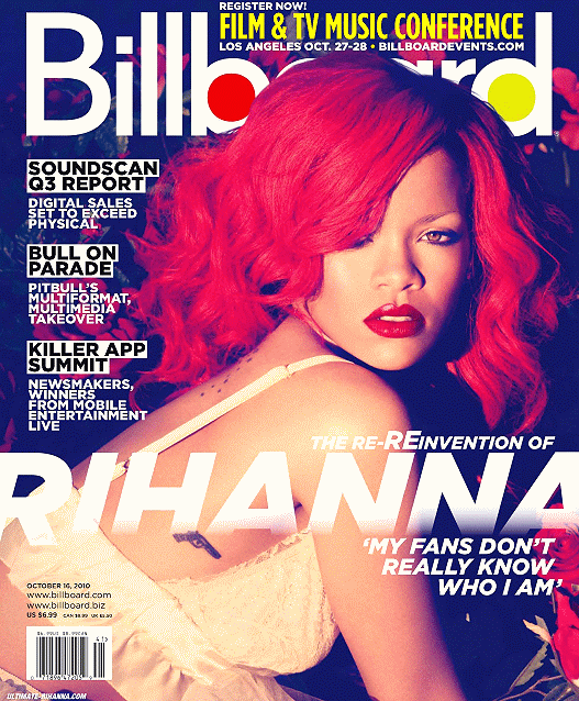
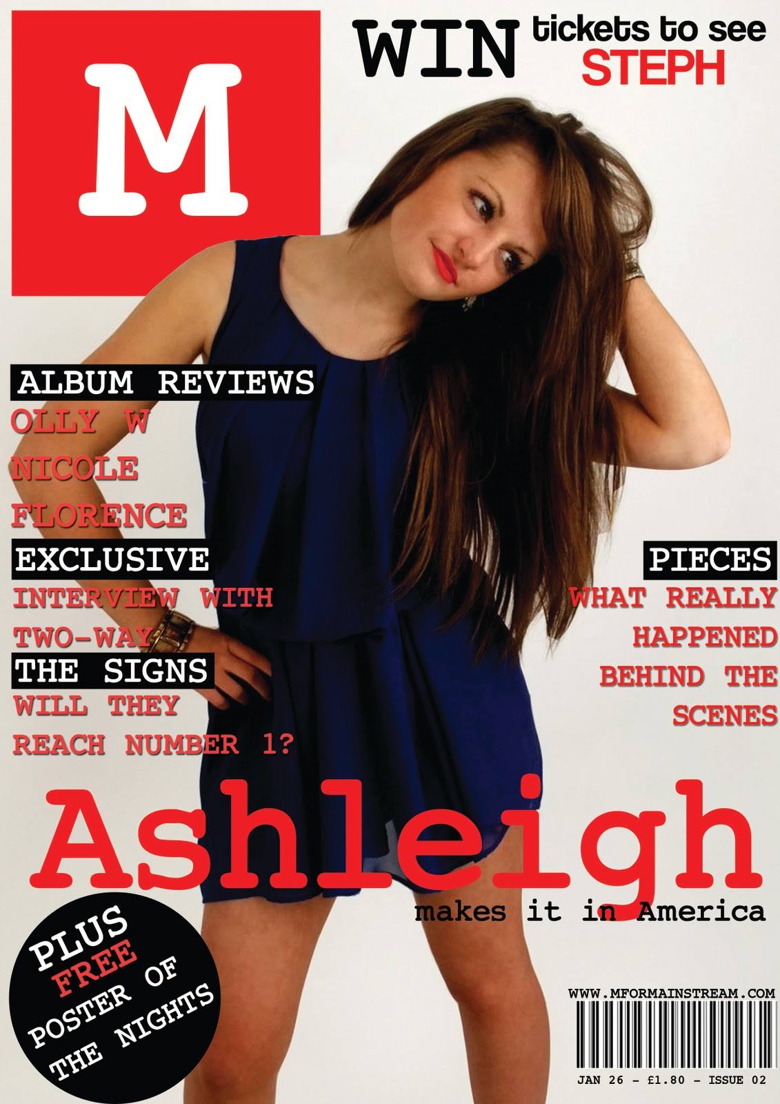
I used a similar colour scheme on my final product as i knew this was an attracting range of colours that suited the target audience. The pose of the model was quite seductive aswell, this is inline with the two magazines i studied and draws the audiences attention onto the page straight away. Like Q magazine i have used a puff on the bottom of my page as i think this is a quick and effective way of telling the audience who else is featured in the magazine. Billboard magazine uses a skyline directly above the masthead, i also used this on my magazine as i think placing something next to the masthead will make it very noticeable, especially with the large emphasis of the word 'win'. My masthead is very similar to the on used on Q magazine, the audience of the magazine said this masthead is very simple but effective and stands out from the rest of the page because of the bright colour. The main sell line of my magazine relates to both of the magazines i studied: it is the artists name in a large font that spreads across the width of the page with writing above and below that gives a brief description about the article. I think this is a very effective convention set by magazines s it quickly grabs the attention of the reader. The costume worn by the models is similar to the costumes worn in the other two magazines: all the outfits are on trend and appealing to the members of the target audience.


contents page

The contents of my page uses similar aspects of professional magazines to attract the audience but it also challenges them to make it different and unique. The logo was used on the contents page of both magazines and my target audience agreed that this was a good feature to use. Also having the word contents in large letters beside the logo makes the page stand out as important. The content of the magazine is separated into categories, the audience would find this helpful when they are searching for something in particular. Images are also an attractive feature to use to appeal to the audience so i used 4 photographs that link to pages within my magazine. Billboard magazine uses an extra feature along the side that informs the reader of the latest chart hits, i decided to use this on my own page as the audience would be interested to know who is currently the number 1 seller. Costumes differ between the two magazines i studied, billboard's selection of outfits looks more formal whereas i have followed Q's decision of cool-casual as i think this appeals more to the audience.


double page spread

On the two magazines i studied the images are quite big, this proves that the audience like the images to be bigger as it balances out the page more making it look less text-heavy and more appealing. The title of the page is different from the two on the professional magazines, however i think mine looks better as it is more noticable and stands out from the rest of the article which means that the audience will notice is straight away.The bottom of the page has the page number in, this is very important to the audience because when they flick through looking for a certain article it helps them to find where abouts it is.I didn't use a drop capital on my magazine as i think it made the top of the page look a bit cluttered and it looks more effective with out the large letter at the start. i used the quotes in my article the same way as both the magazines i studied have, they are surrounded by the article and are in a large, different coloured font, this makes them stand out from the main article and interests the audience. Both articles have an extra feature, on billboard they have a list of Rihanna's top singles and in Q they feature similar artists. On my page i decided to add a reader feature that encourages the reader to get involved with the artists and allows them to feel closer on a personal level by asking them a question. The costume of the models is a key factor here as the images are so large, the clothing must be on trend as it will be picked up on by the audience and contribute to the judgement made by the readers.

Rough cut to final product

Due to the result of my audience feedback i decided to change the font of the main sell line and mast head to made them look sharper and stand out better. I swapped the circular banner for a puff as i think this looks more professional and tidier. There was a large bit of white space around the models head to i added more text to the skyline to take up the space. I used leading and kerning to adjust the spacing between the letters and lines which makes the articles look closer together instead of separate.

The audience thought that the grey box informing teh reader of the latest chart hits was too big and every distracting so i decreased the size to one column width and added another large picture of an artist that is featured in the magazine. My audience said that there wasn't enough content so i decided to add more pages to make the magazine look better value for money. I also changed the arrangement of the title, i think using a double underline makes it look more sophisticated. I was also advised to add a background colour to the caption of the images to make them more readable
My target audience agreed that the page looked very texdt heavy so i enlarged one of the images to break up the page, i created a path around the image so the text would wrap around it. I also used the text wrap tool to embed the quotes in the middle of the text, this broke up the article by using colour to make it look more aesthetically appealing. The introductory paragraph of the article was also said to be too long so i shortened this and fitted it above the image with a border to separate it from the main article. I also added a 'reader question' feature to involve the audience more and make them feel closer to their celebrity idols.


-model draws attention, stands out
-mainstream genre - costume and layout proves this
-strengths: layout - clear and easy to read
-aimed at: trendies and mainstream audience
-Brad would purchase this product as if has lots of detail in
-improve: more quotes from the artists, more sell lines


-drawn to front cover, it is well lined up. pose and costume of models are simple but modern and effective.
-mainstream/pop genre
strengths: front cover and double page spread
-aimed at: a neutral, broad audience: mainstream and indie
-Carmen would purchase this magazine as it is appealing and looks professional
-front cover has an interesting pose from the model
-genre: mainstream, indie, rock-pop
-strengths: images and contents layout
-aimed at: teenages who listen to mainstream and chart music
-Saffron would purchase this magazine if it had an interesting article
-improve: different font for the main sell line as it is quite plain


-model and fonts used on front cover stand out the most
-genre: mainstream/indie/r&b
-strengths: professional layout
-Steph would buy this magazine as it looks good, attracts her attention and has a variety of content


-front cover model draws attention first
-mainstream genre
-strengths: picture, text wrapping
-aimed at: young, cool people who like music
-Michael wouldn't buy it as he doesn't read magazines
-to improve, make it more aesthetically appealing by using less text


-main image is most attracting
-mainstream audience
-strengths
-aimed at:16-25 year olds
-wouldn't purchase this genre, but would consider as it looks professional
-improve: make image looks more professional, not as amateur

Animation Part 1: Brad + Carmen


Animation Part 2: Saffron + Steph


Animation Part 3: Michael + Tom

Evaluation Question 4: Who would be the audience for your media product?


Using imags cut ut from magazine i constructed a moodboard that represents the target audience of my magazine. The reader will be predomently female so i have focussed on them more than the male gender. The moodboard clearly shows that all the readers take pride in their appearence to ensure they look good and very on trend. They shop in big brand shops on the high-street such as River Island, Topshop etc. I have also added some names of foods and drinks that may be consumed by the target audience, this would include Aero bars, Galaxy, Bacardi, Coca Cola, etc. The readers of my magazine will obviously be interested in mainstream music as this is the genre of the magazine, i have used names and pictures of music artists who focus on the same genre of music as my magazine: Katy Perry, Rihanna, Lady Gaga and more. The is also a picture of David Beckham as i would expect the male readers to be interested in sports, especially football. Television programmes watched by the audience of my magazine will mainly be shown on channel 4, this includes The Inbetweeners, Skins, Scrubs etc. but also X Factor and Glee would be quite popular with the readers, i could also consider doing articles on these musical tv shows to attract the audience even more. Other magazines that would have a similar female audience would be More and Look, these are both fashion magazines so i wouldn't be competiting for sales against these magazines as they have a different purpose to mine.

I also made a wordle to describe the audience, it uses words that show:
  • foods they eat
  • spare time activities
  • shops they visit
  • music they listen to
  • tribal groups
  • other magazines that may interest them


Wednesday 16 March 2011

Ammendments For Final Product

Front cover:


As mentioned in my pitch feedback, i changed the font of the masthead and main sell line to make them sharper and stand out more from the rest if the fonts. I also added a line above the main sell line saying 'exclusive interview' i had to put this text in two different colours so the words were not hidden by the background image, i think the two-tone font provides a cool, edgy effect for the cover. I changed the leading between lines to make them look more together. On the bottom, instead of having a circle banner i changed it into a puff with a plus sign graphic to make it look more tidier, modern and sophisticated.

 Contents:

Firstly i added more contents to my magazine and changed the sizes of all the fonts so they weren't too large. the 'number one' box was made small so it only took up one third of the width of the page instead of a half, making the picture of Steph wider didn't work as well as i expected so i increased the size of Liam's image and places it next to the image of Steph. The captions on the images needed a white background to make them more visible and easier to read.

 Double page spread:


I made lots of changes on the double page spread so that it didn't look too boring and 'wordy' i increased the size of one image an made a clipping path on photoshop so the text wrapped around the image slightly. I also used the wrap tool on the quotes to make the text around it look neater and more squared. I realised that i needed to change the page number as before it said page 6, however on a generic magazine the even numbered pages come first. I still had half a column of white space left so i decided to add a reader feature to involve the audience more into the magazine.

Friday 4 March 2011

Pitch Feedback

Teacher Feedback:

I am really pleased with the first pitch reflection of my rough cut magazine, i feel that with a few tweaks i can make my magazine into level 4 boundaries. I agree with what my teacher has said about my work: a couple of her i had picked up on myself and also a few she has mentioned i had not, so i will take into account all of the points and change my magazine to show this.

Peer Feedback:
The people in my class picked up on my layour as been really effective and close to a professional magazine which is what i was aiming for, one person suggested i make the font for the mast head and main sell line more sharper so it stands out more. People commented on my good photography that compliments the pages of my magazine and also the house style that follows throughout the magazine was noticed.

Thursday 3 March 2011

Comparison To Professional Magazine

Front Cover: The masthead of my magazine is closely inspired my Q magazine, as is the colour scheme as i think this clearly represents the genre of the magazine. The main sell line is similar to the one on Billboard, it stretches across the full page in the lower third. Also the other sell lines use coloured boxes behind the text like those on the front cover of Billboard, this makes the article stand out. Q uses a circle graphic on the cover so i decided to also use this on my front cover to add something different and make it more aesthetically pleasing. On both magazines the main sell line has a few words below it, i may also add some text above the sell line like these two magazines. My front cover has a sky line like the one on Billboard magazine, this fills in a white space above the models head. The image on the cover of Q and Billboard magazine overlaps the masthead, i have also done this on my magazine as it makes the picture look more dominant on the page.  
Contents Page: Like Billboard magazine i have a box on my contents page that informs the reader of the latest number one single and album. The magazine logo is also displayed on the contents page on both magazines so i also decided to do this to keep within the common theme. The main image on the contents page of Billboard as the text wrapped around it, i may also do this as it looks very effective. From looking at both magazines i can see that my contents page does not provide enough contents with only pages so i will need to add more articles and reduce the size of the text so it fits on. I have also used secondary images on my contents page as both other magazines do, they also display the page number of the article linked to the picture.  

Double Page Spread: Front looking at all three pages i can see immediatley that my text on the page is too large and very cramped together, yet still has a small section of white space at the end of the article. Like all pages i have included the page number at the bottom of the page, along with the magazine logo.  have embedded quotes taken from the article into the text and displayed them in a larger, red front to make them stand out from the main body of the article. I have used a variety of images like those on the professional magazines to give the reader different things to look at, the ratio of images to text needs to be perfect so the page does not look to over, or under cramped and boring. On my page i think i need to play around with the positioning of the images to make the page look more exciting and readable.

Saturday 19 February 2011

Double Page Spread Draft

to start with i added the title of my face with the subheading. In the bottom corner i added the page number and logo and in the top corner i emphasised the exclusivity of the article to make the readers think they are getting something special


i used the rectangle frame tool to add two pictures onto the second page


i copied the article onto the page and put it into columns


i added a quote in the red font that has been used throughout the magazine, this attracts the audience's attention and draws them into the article


i moved the quote as i thought it looked more effective in a different position and added a smaller photograph to the bottom of the page


i added one more quote to one of the pictures and captioned the bottom picture with the names of the band members


I am quite impressed with the way my article has turned out. When i produce the final cut i will use the wrap tool correctly to make the text around the quote look neat. I think i will also need to make the text smaller as it is large compared to other music magazines. The bottom picture is the most effective so i may make this bigger, as for the top picture i will cut out my models from the background and use this image on the first page with the text wrapped around it, this make look better and less black and white than it is now.