On my contents page there will be two or three images down the side to attract the audiences attention. I have decided to use close ups for these images as it gets to the point straight away, however i have included some full length shots of Liam with his guitar as this will appeal to the audience.
43221 Darlington, Queen Elizabeth
Showing posts with label photography. Show all posts
Monday, 14 February 2011
Friday, 11 February 2011
Double Page Spread Shoot
I will use two photographs on my double page spread: one taken on location and one taken in the photography studio. The images will look casual yet appealing to the audience and provide an good text-to-image ratio for the page to ensure the audience does not get bored. I used a guitar as a prop in one of the images to add to the theme of music, however i don't think this image works as the other model looks out of place with no instrument. My models are centrally framed within the image although there is a fair bit of head space at the top of some images so i may crop this out, along with a greater amount of white space to one side of the subject. The models face the camera and have adopted a happy, cheery facial expression to suggest they are please and comfortable within the music industry. There is a direct address with the reader and the model to show that they are regular, down to earth people.
Contents Page Shoot
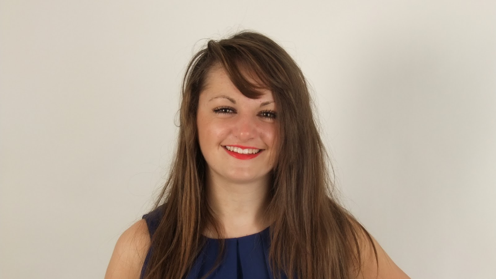
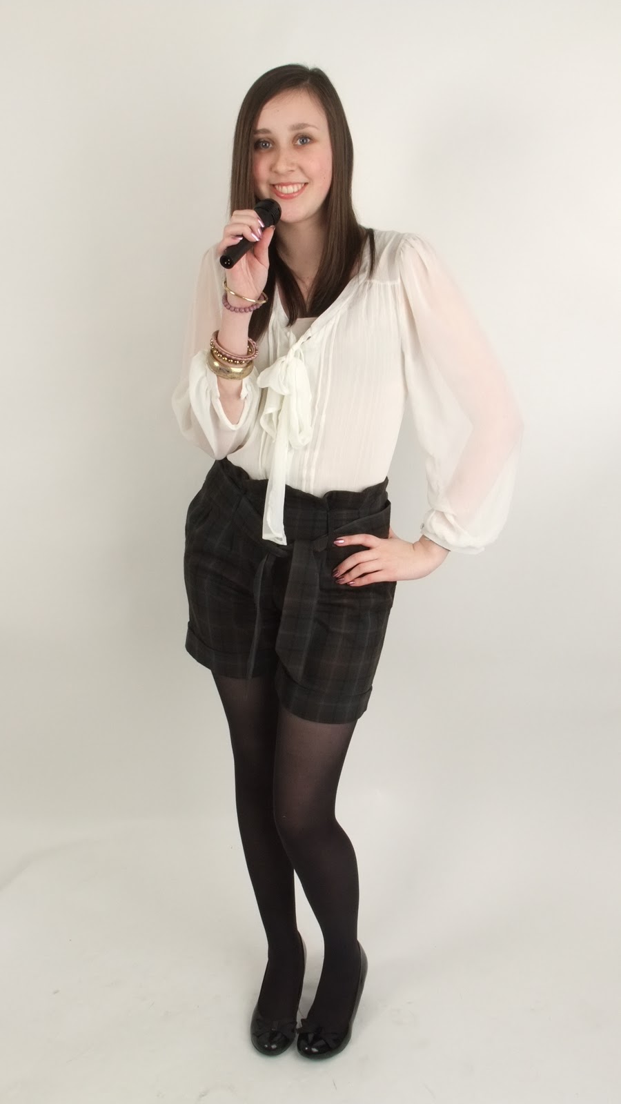
The photograph on my contents page is more casual than the front cover so it doesn't distract the audience from the rest of the content. I used a microphone as a prop in some images to add to the theme of music. My model is centrally framed within the image, there is a fair bit of head space at the top of the image so i may crop this out. All the poses face towards the camera suggesting the artist is comfortable with themselves and how they are portrayed in the industry. Again, i took the photos using a step ladder to help me gain height and include the whole model in the photograph. There is a direct address with the reader and the model meaning they are attracted to the image and feel 'on a par' with the artist.Every image shows the model smiling which connotes she is very happy with where she is in life and loving every minute of it, this appeals to the audience and creates a narcissistic relationship between them and the model.
Front Cover Shoot
My front cover image is a long shot photograph. I have taken photographs of my model in various poses: these all leave room for the mast head and a sky line to be placed along the top of the page and sell lines to be positioned along the side of the magazine. I used professional lighting in the photography studio to enhance my images and make my model look flawless. I took my photographs from a height on a step ladder, this ensure i could get the whole body in of the model and the audience do not feel intimidated by the high angle shot. The model is centrally framed to draw in all the attention onto her and the front cover. The facial expression ranges from smiley to sultry and many of the photographs create a direct address to the audience, this engages them with the magazine.
Monday, 7 February 2011
Hair and Make up
I have looked through various issues of the fashion magazine Look to get an idea of how i want my female model's hair to be like. I like the natural, flowing look of the wavy, tousled hair. It looks simple and effortless but attractive which is key to my audience. The volume in the hair make the model look feisty, this also appeals to the reader of my magazine and forms a narcissistic relationship. The messy up to looks casual and relaxed but also smart and sleek, these hairstyles will influence the personality of the model and my magazine.
I have scanned in some pages from a Victoria Jackson beauty tips booklet i own. These pages describe how to create a natural and clear complexion. The make up will enhance the model's natural beauty, i will use eyeliner to attract more of the attention to the eyes and therefore emphasising the direct address to the audience and 'inviting them to read the magazine'
I followed the tips from the Victoria Jackson beauty book to make my models look naturally made up. I kept the make up simple with bright lips to enhance their femininity, For Ashleigh i straightened bits of her hair and added volume by back combing, as shown in Look magazine, this will stand on the front cover of my magazine. For Steph i straightened all of her hair so she looks relaxed and casual which was my aim for the shoot.
For my male model i used hair gel to style their hair
Subscribe to:
Posts (Atom)