Front cover:
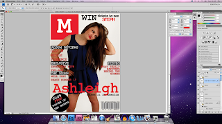
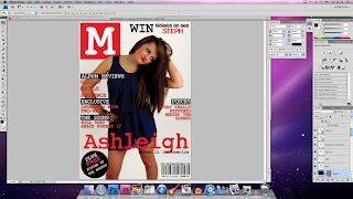
As mentioned in my pitch feedback, i changed the font of the masthead and main sell line to make them sharper and stand out more from the rest if the fonts. I also added a line above the main sell line saying 'exclusive interview' i had to put this text in two different colours so the words were not hidden by the background image, i think the two-tone font provides a cool, edgy effect for the cover. I changed the leading between lines to make them look more together. On the bottom, instead of having a circle banner i changed it into a puff with a plus sign graphic to make it look more tidier, modern and sophisticated.
Contents:
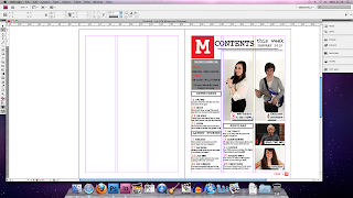
Firstly i added more contents to my magazine and changed the sizes of all the fonts so they weren't too large. the 'number one' box was made small so it only took up one third of the width of the page instead of a half, making the picture of Steph wider didn't work as well as i expected so i increased the size of Liam's image and places it next to the image of Steph. The captions on the images needed a white background to make them more visible and easier to read.
Double page spread:
I made lots of changes on the double page spread so that it didn't look too boring and 'wordy' i increased the size of one image an made a clipping path on photoshop so the text wrapped around the image slightly. I also used the wrap tool on the quotes to make the text around it look neater and more squared. I realised that i needed to change the page number as before it said page 6, however on a generic magazine the even numbered pages come first. I still had half a column of white space left so i decided to add a reader feature to involve the audience more into the magazine.


No comments:
Post a Comment