Front Cover: The masthead of my magazine is closely inspired my Q magazine, as is the colour scheme as i think this clearly represents the genre of the magazine. The main sell line is similar to the one on Billboard, it stretches across the full page in the lower third. Also the other sell lines use coloured boxes behind the text like those on the front cover of Billboard, this makes the article stand out. Q uses a circle graphic on the cover so i decided to also use this on my front cover to add something different and make it more aesthetically pleasing. On both magazines the main sell line has a few words below it, i may also add some text above the sell line like these two magazines. My front cover has a sky line like the one on Billboard magazine, this fills in a white space above the models head. The image on the cover of Q and Billboard magazine overlaps the masthead, i have also done this on my magazine as it makes the picture look more dominant on the page.
Contents Page: Like Billboard magazine i have a box on my contents page that informs the reader of the latest number one single and album. The magazine logo is also displayed on the contents page on both magazines so i also decided to do this to keep within the common theme. The main image on the contents page of Billboard as the text wrapped around it, i may also do this as it looks very effective. From looking at both magazines i can see that my contents page does not provide enough contents with only pages so i will need to add more articles and reduce the size of the text so it fits on. I have also used secondary images on my contents page as both other magazines do, they also display the page number of the article linked to the picture.
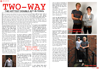
Double Page Spread: Front looking at all three pages i can see immediatley that my text on the page is too large and very cramped together, yet still has a small section of white space at the end of the article. Like all pages i have included the page number at the bottom of the page, along with the magazine logo. have embedded quotes taken from the article into the text and displayed them in a larger, red front to make them stand out from the main body of the article. I have used a variety of images like those on the professional magazines to give the reader different things to look at, the ratio of images to text needs to be perfect so the page does not look to over, or under cramped and boring. On my page i think i need to play around with the positioning of the images to make the page look more exciting and readable.


No comments:
Post a Comment